March 13 2018 CSS Containers and Skipole Project Meet
Darren brought a problem he had had with some wi-fi headphones but, after various attempts to find a solution, we concluded that there was a hardware compatibility problem.
John thanked members for their contributions at the previous meeting to the GDPR presentation which had been well-accepted by non-geeks. He went on to highlight a number of changes to HTML and CSS. Ostensibly there had been very few changes to HTML — such as the removal of the <keygen> and <menuitem> elements — but the apparently superfluous <main> element which had been added four or five years earlier had been revealed as the foundation for some far reaching developments.
He recalled that, when Dave Fisher did his presentation on HTML5 in 2010, he had drawn a diagram of the semantic elements:
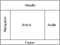
John had used this layout on the websites he had developed by using the CSS code:
nav {float: left; width: 19%; padding: 1em;}
aside {float: right; width: 19%; padding: 1em;}
article {margin-left: 22%; margin-right: 22%; padding: 1em;}
But, unless the <article> element is longer than both the <nav> and the <aside> elements, the <footer> element moves to one side, under the two shorter elements.
This problem had been elegantly solved by the arrival of the flex container in CSS.
Using the HTML structure:
<body>
<header> … /<header>
<main>
<article> … </article>
<nav> … </nav>
<aside … </aside>
</main>
<footer> … </footer>
<body>
and the CSS declarations:
main {display: flex;}
main > article {order: 2; …}
main > nav {order: 1; … }
main > aside {order: 3; … }
the three elements are contained in the <main> element above the <footer> element and have equal height.
In fact, there are two new containers in CSS: the flex container which flexes in one dimension only and the grid container which reorganises its elements in two dimensions. For example, a grid container might contain eight elements which appear in two rows of four when viewed on a smartphone in landscape orientation but in four rows of two when viewed in portrait orientation. With a horizontal flex container, the elements would be wider in landscape format and narrower in portrait format but their disposition would not change.
A page in the CSS docs illustrates the various layout possibilities with a flex container from all the elements expanding to fill all the space to sharing any spare space between the elements.
He showed the range of flex and grid attributes in Some notes on CSS along with the new mask attributes attributes for more complex colour schemes and the voice attributes for use with speech synthesisers. Finally, be mentioned the new @counter-style rule enabling the use of a wider range of custom styles in enumerated lists including the adaptation of existing list styles.
Bernard introduced the Skipole Project. skipole.py is a framework for creating Web Server Gateway Interface (WSGI) connections between web servers and Python applications. Among the available connections are:
There are four main functions:
start_projectstart_callsubmit_dataend_call
These have access to a a dictionary of widgets and fieldnames. Pages which require user input are known as responders but the final output is either a <template> element or a JSON file.
skiadmin, a web based interface, is available at localhost:8000/skiadmin.
He demonstrated how he had used the framework for the Remscope at the Todmorden Astronomy Centre, a project he had shared at the 9 October 2017 meeting.
For him, the advantage of using skipole.py is that it is controllable. Further information is available on the Wiki.